parking made accessible
Taking apart an industry and putting it back together
Role
Type
Date
CHAPTER #1
THE CONTEXT
Finding available parking has been a largely unsolved problem and continues to have difficulty integrating with current technology effectively. What’s even worse is the market is scattered; the user is required to have multiple apps to pay for parking in different areas. This is a logistical problem that is very much prevalent in Vancouver; particularly in the downtown core.
ParkIt is a concept app that allows users to view real-time parking availability and pay for their session all in one platform.
CHAPTER #2
defining the goal &
sprint questions
It was very critical to understand early on that this project would only be feasible if we partnered with existing parking management companies, so this solution had to be attractive to the end consumer in terms of design and functionality but just as important to the partnering companies’ bottom line.
THE OBJECTIVE
Create a platform that will allow users to view and pay for available parking in real time from different vendors. In essence, this platform will unify the market into a single solution. From a partnership standpoint, this solution needs to increase usage of various parking facilities and increase the compliance and enforcement of paying for their parking.
SPRINT QUESTIONS
1. Can we create a platform that will allow users to access parking information in different areas such as lots, meter parking and restricted parking?.
2. Is this model feasible?.
3. How can we leverage the existing platforms?.
4. How can we clearly define our value to our potential partners?.
5. Revenue from parking violations accounts for 33% of total revenue on average. is parking payment compliance something these companies even value?.
CHAPTER #3
the research &
user experience
RESEARCH
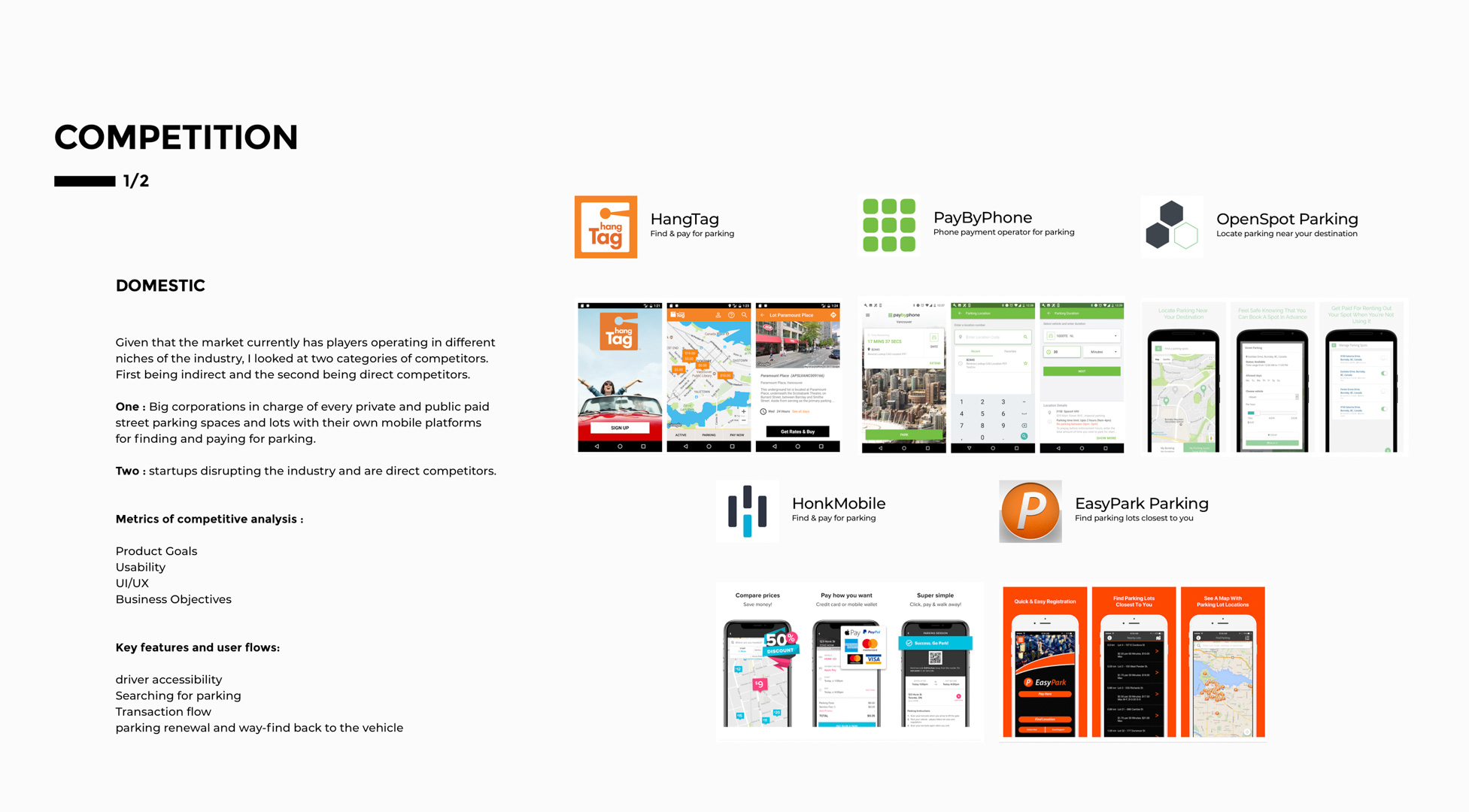
Because this project has a lot of moving parts, it is important to thoroughly strategize execution as well as gather as much information as possible about the market as it stands today. Both from the user experience point of view as well as the competition operating in the space.


USER EXPERIENCE
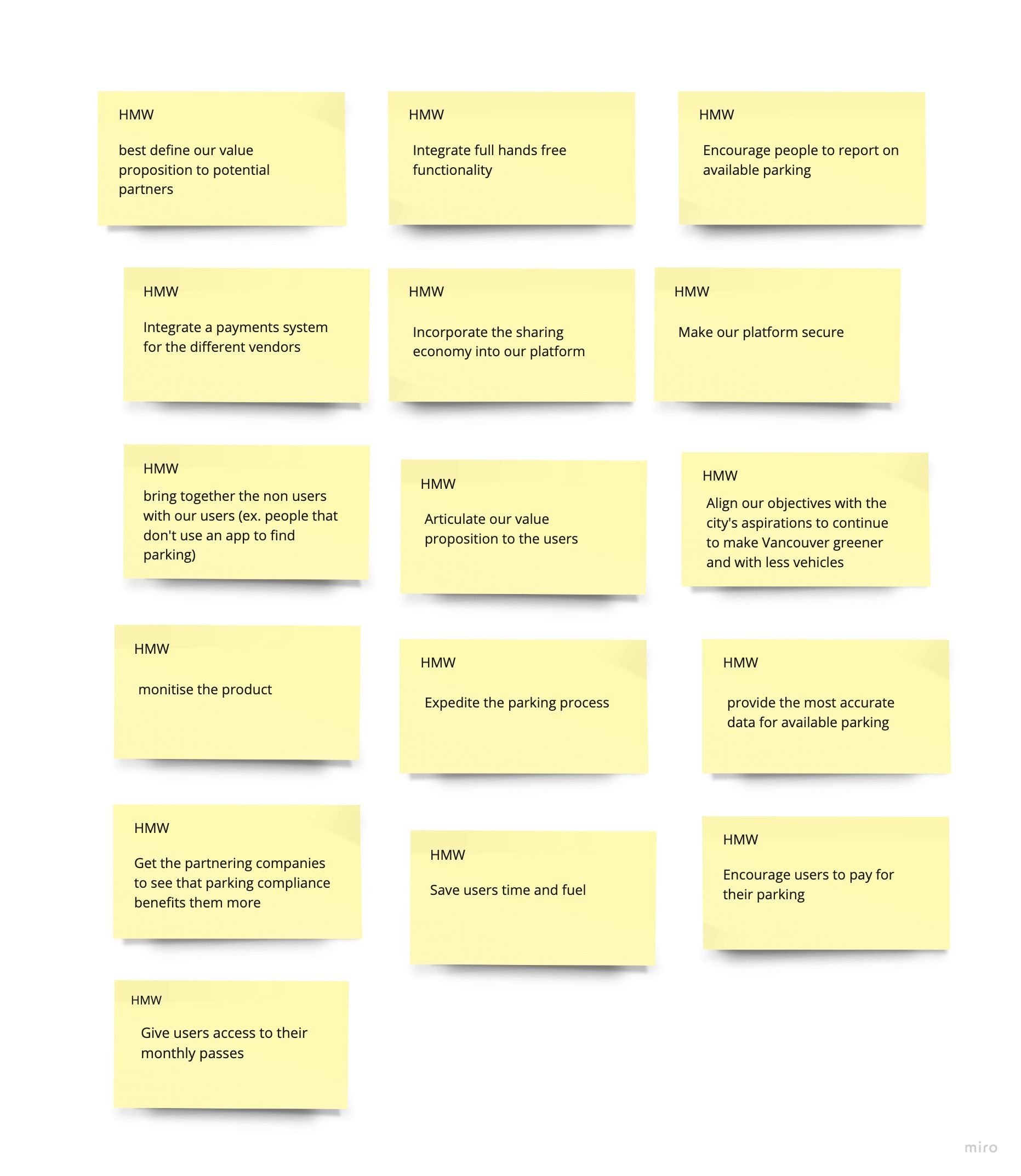
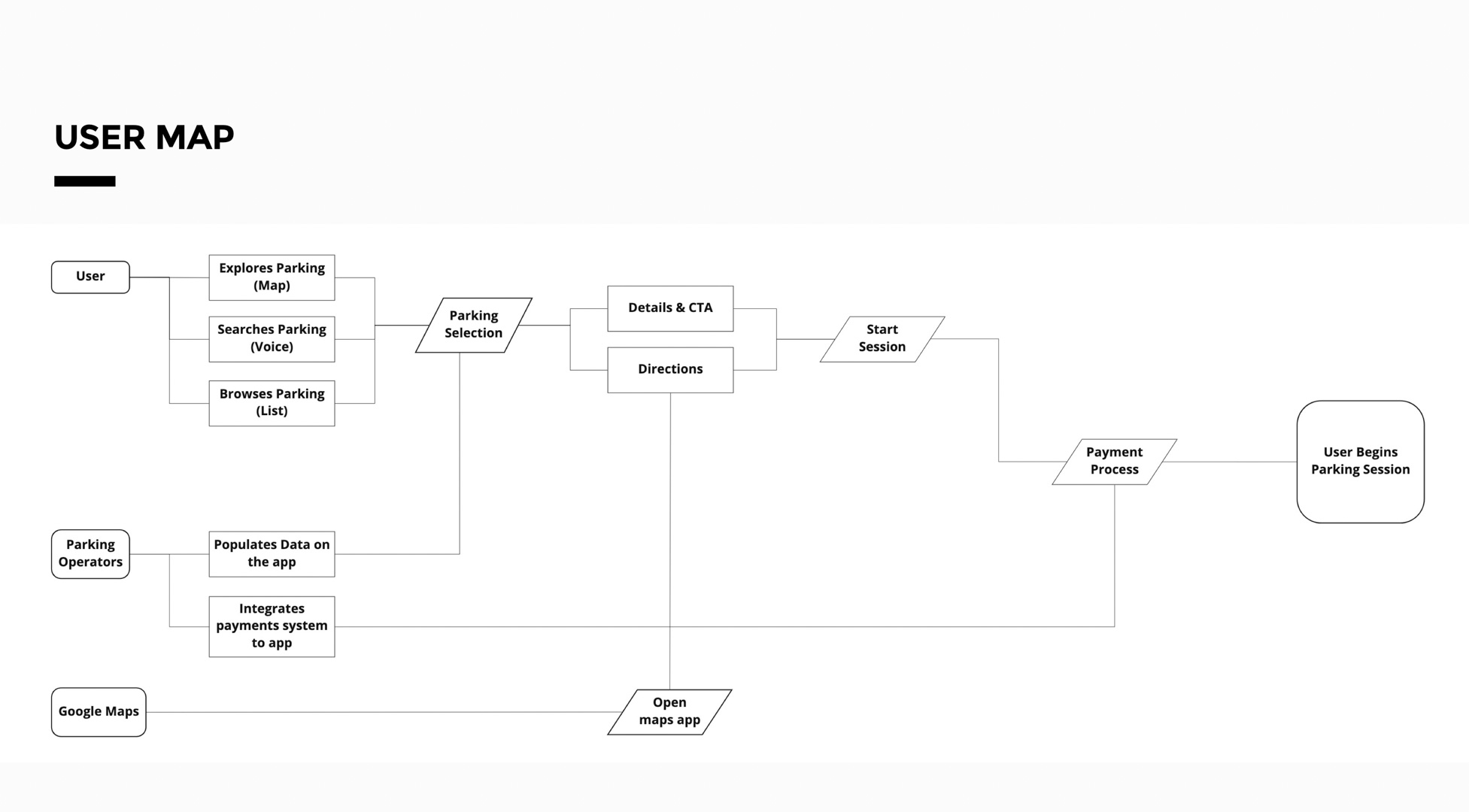
Using the data acquired from the discovery phase it was time to develop a foundation for the design by doing two key exercises; ‘How Might we’ and ‘lightning demos’. In conjunction with that, I created a simple user map to define the key points of the experience.


CHAPTER #4
exploring solutions
Given all of the gathered information, it was time to begin designing a solution. I began by identifying a particular user that I believe was largely underserved, the driver. Therefore I focused my attention on designing the voice functionality of the app. I then proceeded to explore the visual design by drawing a few concepts for different types of implementation and created a storyboard to get a sense of direction. The final steps included building a high fidelity wireframe followed by the final mockups and prototype.


CHAPTER #5
THE DESIGN

DRIVE MODE
- Minimal Layout
- Clear call-to-actions
- Scannable
- Carousel interaction may not be intuitive due to card size
- Search results show one spot at a time. Users may want to see multiple alternatives at once.

voice search

CHOOSE

pay
couldn't pay for your parking, would it?.

locate
interaction design
CHAPTER #6
THE TEST
The testing phase was quite challenging given that a lot of the product's value proposition relies on the back end. The focus of these user tests was primarily intuitiveness and usefulness of key points in the user journey.
- is the most relevant information displayed?
- Are call-to-actions clear?
- Is the UI scannable?
- 3 out of 5 users did not know you could swipe the cards for different parking options.
- 2 out of 5 users found the payment process flow to have too many steps.
- 5 out of 5 users found the UI easy to scan and intuitive for the most part.
- 3 out of 5 users said they would like navigational access to other areas of the platform when they have an active session.
CHAPTER #7
THE conclusion
Working on this project has been an absolutely invaluable experience that has challenged me and every area that encompasses the art of designing digital products. It has also shown me what areas I am particularly weak and will focus on improving moving forward such as conducting user testing and creating more thorough prototypes. Today ParkIt is a concept that I hope to bring to market in the near future. With emerging technologies in the transportation industry like collaborative parking and autonomous vehicles, the landscape continues to shift. This reaffirms the important role designers play when creating the products of today while understanding the disruptions of tomorrow.
I'm actively looking for full time opportunities. Feel free to reach out if you believe I would be a great fit.
Let's Chat

Contact info


